Date: January 4, 2024 | Photography: Rett Peek | Styling: Bailey Dougan | Producer: Stephanie Maxwell Newton |
Paint companies’ Color of the Year picks feature a coastal flair for 2024
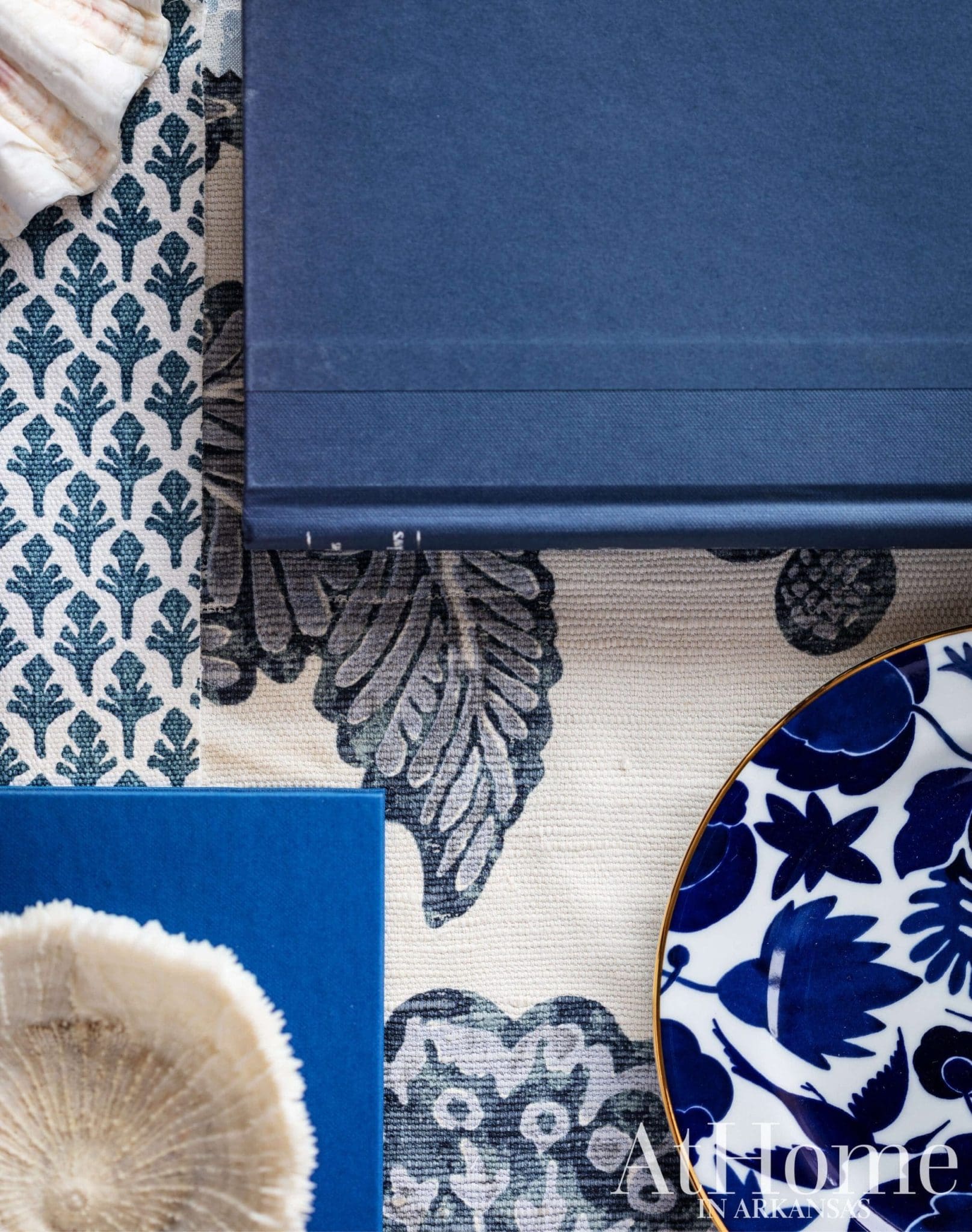
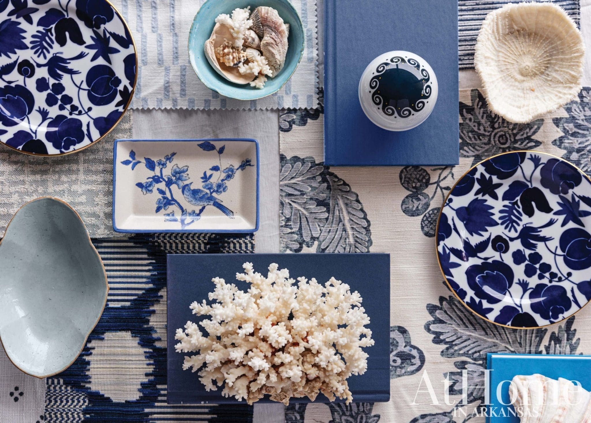
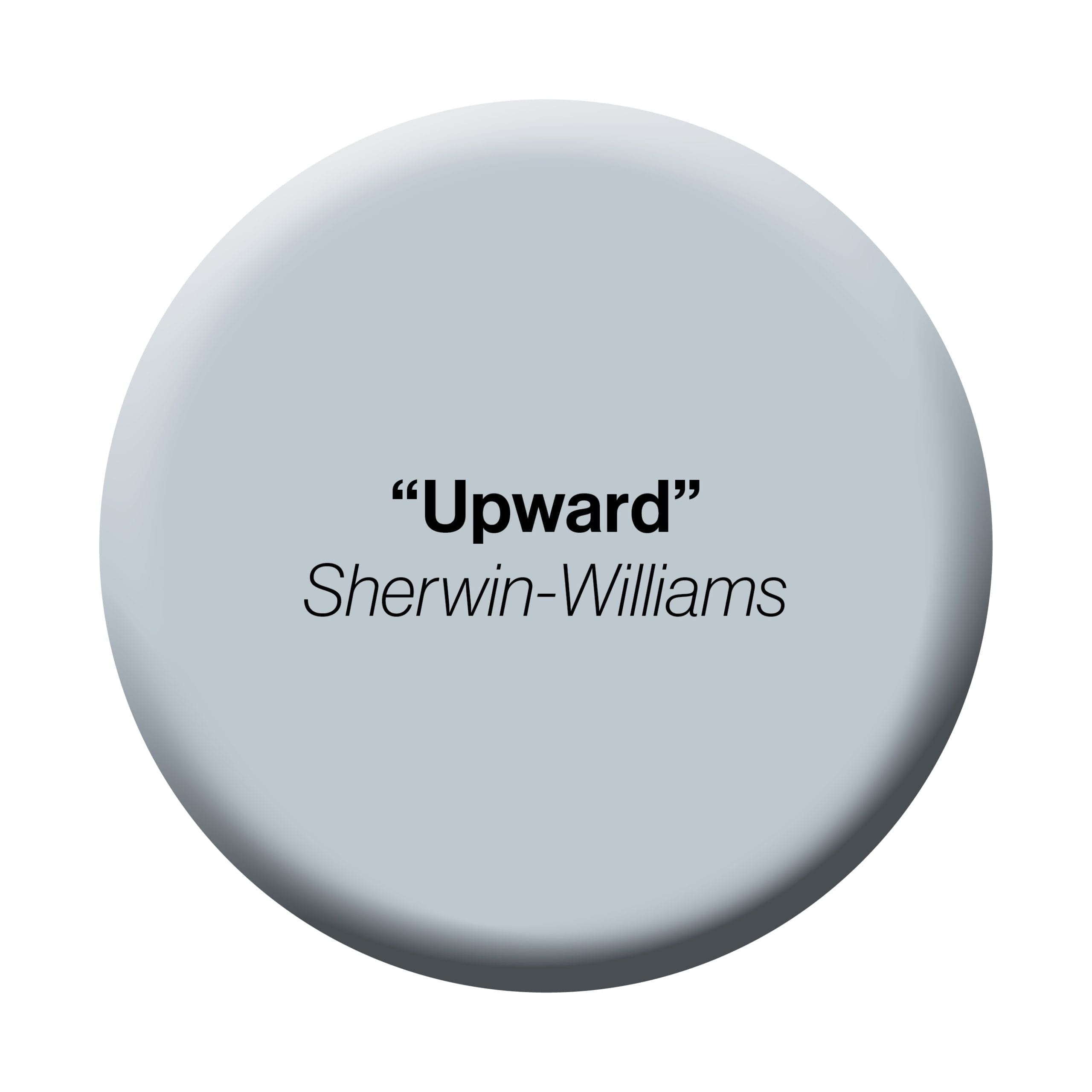
There’s a reason blue is often referred to as a neutral color in interior design: it looks good in just about every setting. The most prevalent hue seen in nature, it’s also known to bring a sense of calm to interiors. Therefore, it’s no surprise paint companies are returning to this versatile tone for their Color of the Year selections, such as Sherwin-Williams’ “Upward.” “We’ve seen nature-inspired colors taking over since the beginning of this decade, with greens and earthy tones taking over the first few years,” says Sue Wadden, the company’s director of color marketing. She describes “Upward” as a light and airy blue with a little bit of gray. “It’s a very peaceful color that evokes happiness and positivity, creating a calm environment in any room.”
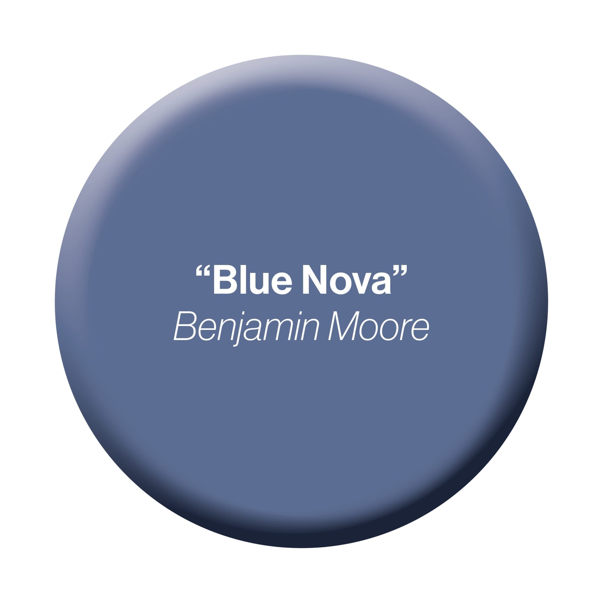
Benjamin Moore’s Color of the Year, “Blue Nova,” is a more saturated, violet version of blue. Hannah Yeo, senior manager of color marketing at Benjamin Moore, describes the hue as one that bridges warm and cool tones. “This alluring mid-tone features an enchanting duality, capturing the spotlight and elevating the
everyday with classic appeal,” she says. “For 2024, we found inspiration through travel—both near and far—breaking out of our ordinary routine to experience something new and capturing color moments along the way.” Read on for advice on incorporating these paints into your home, color pairings, and finds inspired by the Pantone Color of the Year.
Soothing Hue
While “Upward” is a versatile color that works well in a kitchen or bath, “it’s also a great choice for respite rooms like primary bedrooms, since it evokes tranquility,” Sue says. “The shade has calm gray undertones and a touch of periwinkle—making it a great choice for nurseries as well.”
Coast to Coast
Sue says she sees “Upward” being paired most often with white or navy, such as “Snowbound” or “Gale Force,” both also from Sherwin-Williams. “It’s the perfect combination to create a coastal chic vibe in your home, and we think this is going to be the biggest trend in design in the years to come.”
Deep Tone
“The depth of ‘Blue Nova’ makes it a great fit for a study or home office,” Hannah says, noting that its flexibility also makes it an excellent choice for a bedroom or living room. “Likewise, ‘Blue Nova’ is fantastic on cabinetry—think of a kitchen island, base cabinets, or vanity painted this color.”
Accent or All the Way
“”Blue Nova’ offers an opportunity to be creative whether it is used to drench a room in color or define a portion of a room with a captivating hue,” Hannah says. Not sure you’re ready to paint the room, including all the trim? Try it on just the ceiling for an approachable statement.
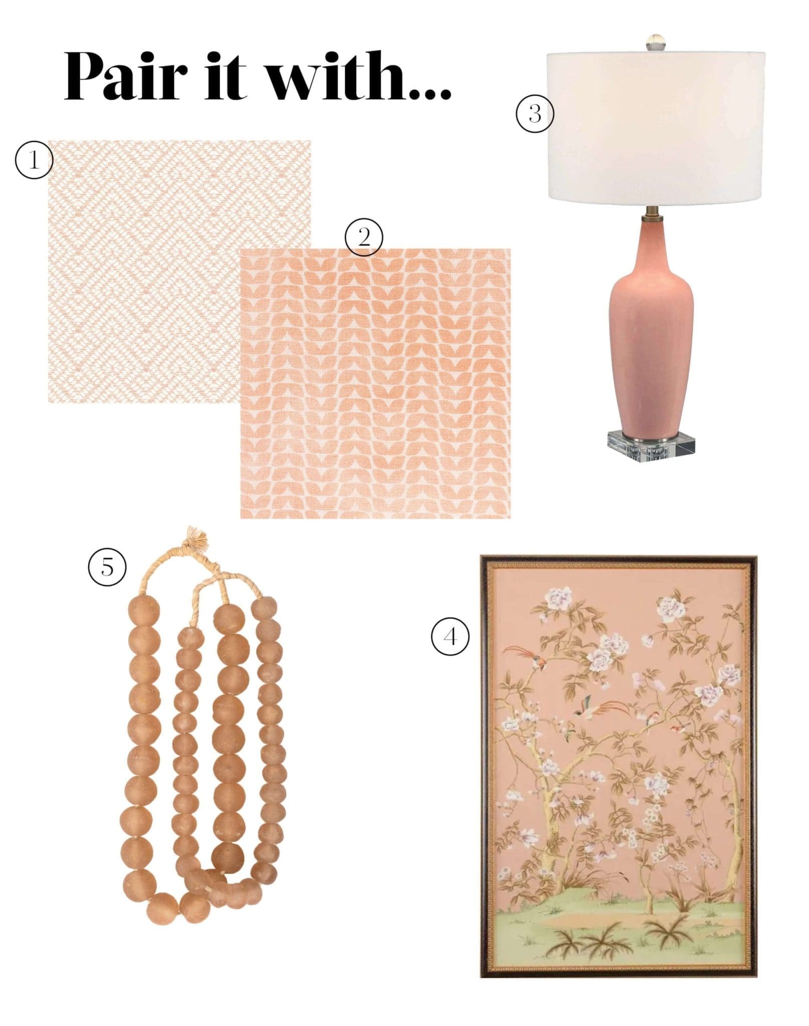
Finds inspired by “Peach Fuzz,” Pantone’s Color of the Year
1 “On Point Reef” by Bassett McNab Fabric.
2 “Knoll 2 Petal” by Stout Textiles.
3 Uttermost “Anastasia” glazed table lamp.
4 Chelsea House “Edgedale” panel.
5 Glass beads from Ngala Trading.
Special thanks to Cobblestone & Vine and K. Lewis Interior Design for products used in this shoot.
