Date: July 31, 2023 | Story: Virginia Brown | Photography: Rett Peek | Styling: Bailey Dougan |
Designer Kricia Palmer gives her personal primary bath a well-deserved glow-up

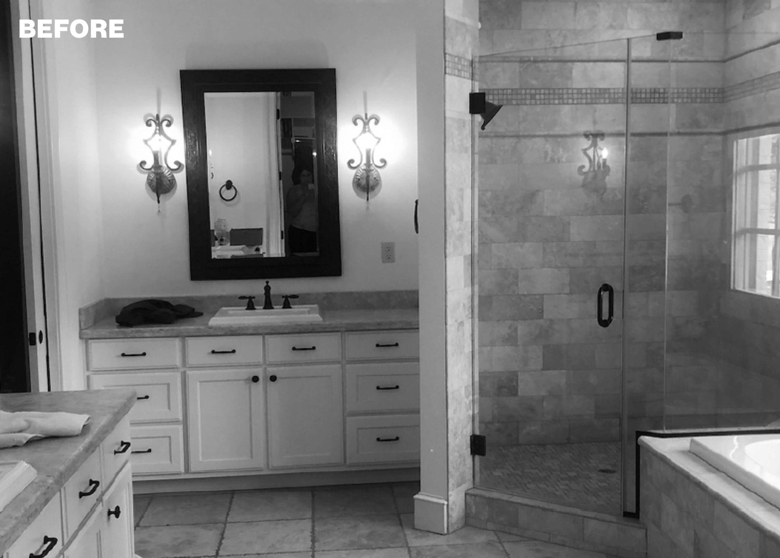
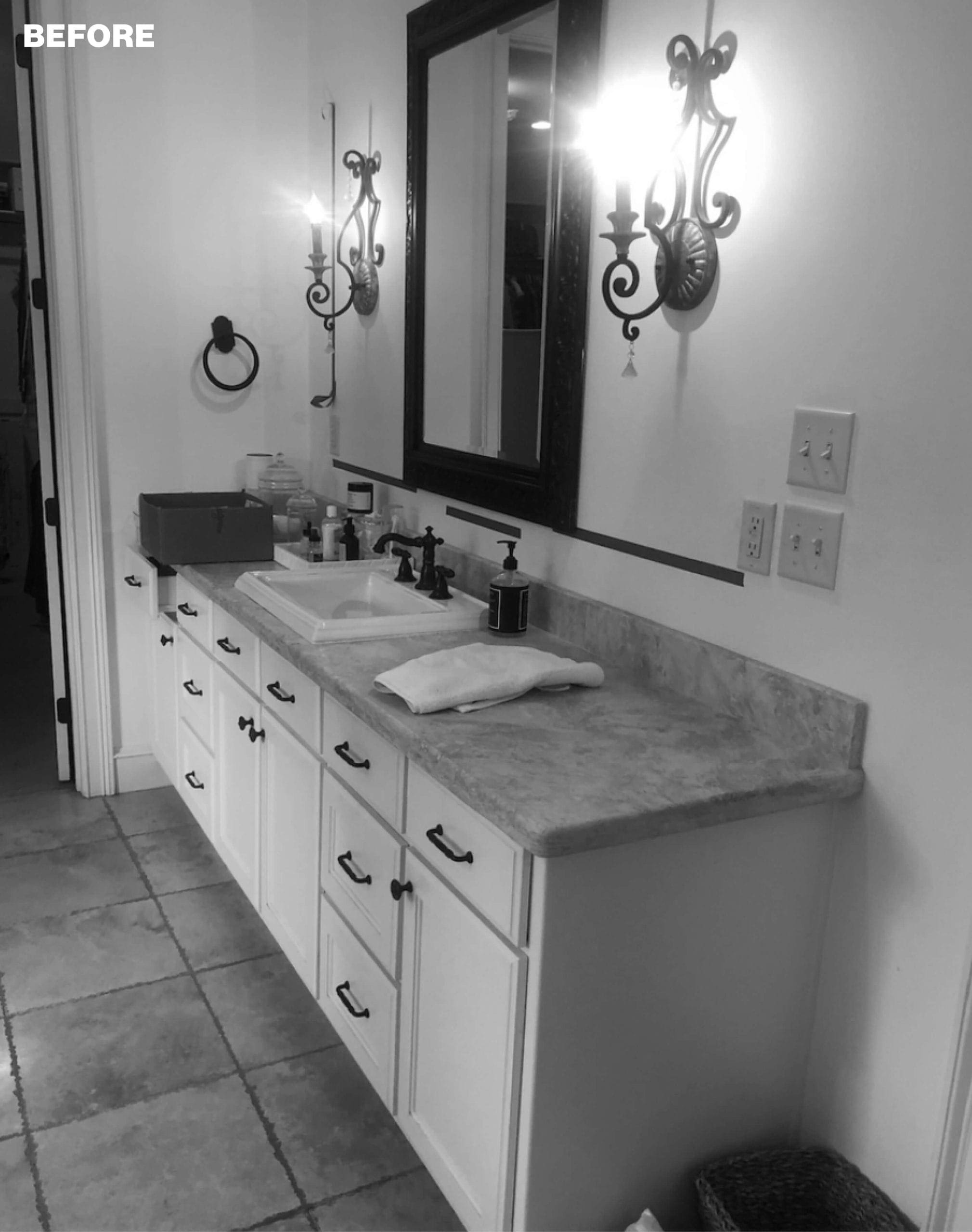
After seven years in their Roland home, the time was finally right for Kricia Palmer and her husband, Jon, to update their primary bathroom. The house was built in 2007 with some of the period’s usual hallmarks: travertine tile floor, dark antique bronze fixtures, and warm lighting. “It just felt drab,” Kricia says. “I focus a lot on how I feel in different spaces, and I wanted to be able to pick out clothes, put on makeup, and get ready in a space that felt luxurious and relatively timeless.”
As owner of House Calls for Physicians, an interior design and coaching business, Kricia designed the project herself. She considered alternate layouts but soon realized the existing flow actually just needed a few tweaks. So while keeping the vanities, shower, and tub in their existing locations, she set about improving both the utility and style of the room.
“Before the remodel, there was a lot of wasted space with the sinks located in separate vanities,” she recalls. Relocating both to the longer wall freed up space by the shower for a sit-down makeup vanity and built-in storage, both priorities for Kricia.
The shower was retiled in a classic white subway tile with inset border pieces to give the effect of a chair rail and picture molding, and the shower entry was updated as well. “We decided not to have a door because the shower is large enough that water doesn’t splash out, and it gives a cleaner look,” Kricia says. A pony wall separates the space from the updated deck-style tub, and the same subway tile and decorative application continues as the surround for a seamless look.
The designer finished the room with nickel plumbing fixtures, quartz countertops, new flooring, fresh lighting, and a custom window covering. Benjamin Moore’s “Chantilly Lace” on the trim and doors complements a textured wallpaper by Schumacher, which she says adds depth to the otherwise all-white space.

“I just wanted it to feel light, airy, and luxurious.”
—Kricia Palmer, homeowner and designer

Situating both sinks on this wall created an area for a sit-down make-up vanity and built-in storage next to the shower.
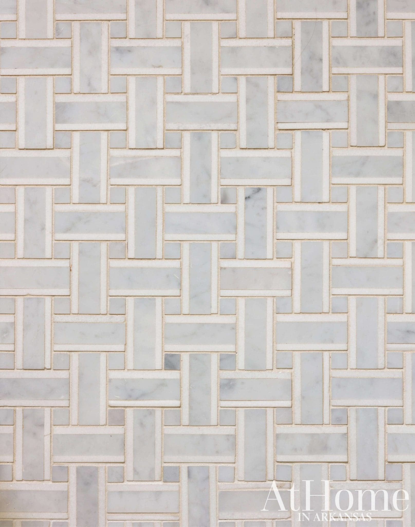
Pretty Pattern
“I knew I wanted the floor to be the focus and the most interesting element,” Kricia says of the basketweave marble tile underfoot. The selection is also in keeping with the airy and timeless feel that was the goal of the remodel.

Soft Selection
The Roman shade’s lilac hue connects the room’s palette to the adjoining bedroom, while the curved lines on the fabric tape further the “calming and graceful” feel of the space, Kricia says.
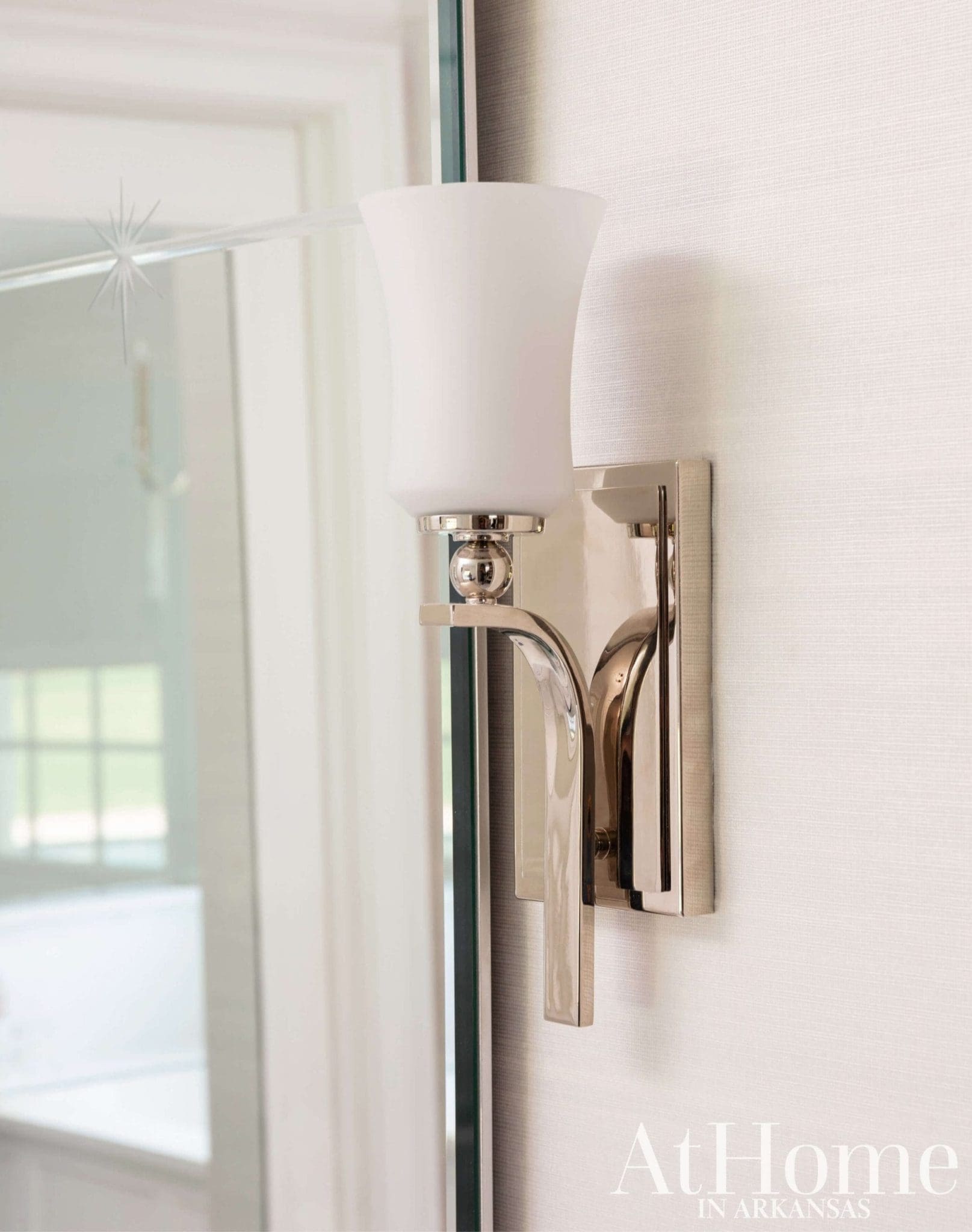
Bright Idea
Outdated bronze sconces with scrollwork were swapped for a transitional style that suits the lighter space, and the ball detail mirrors the sphere seen on the chandelier over the tub.
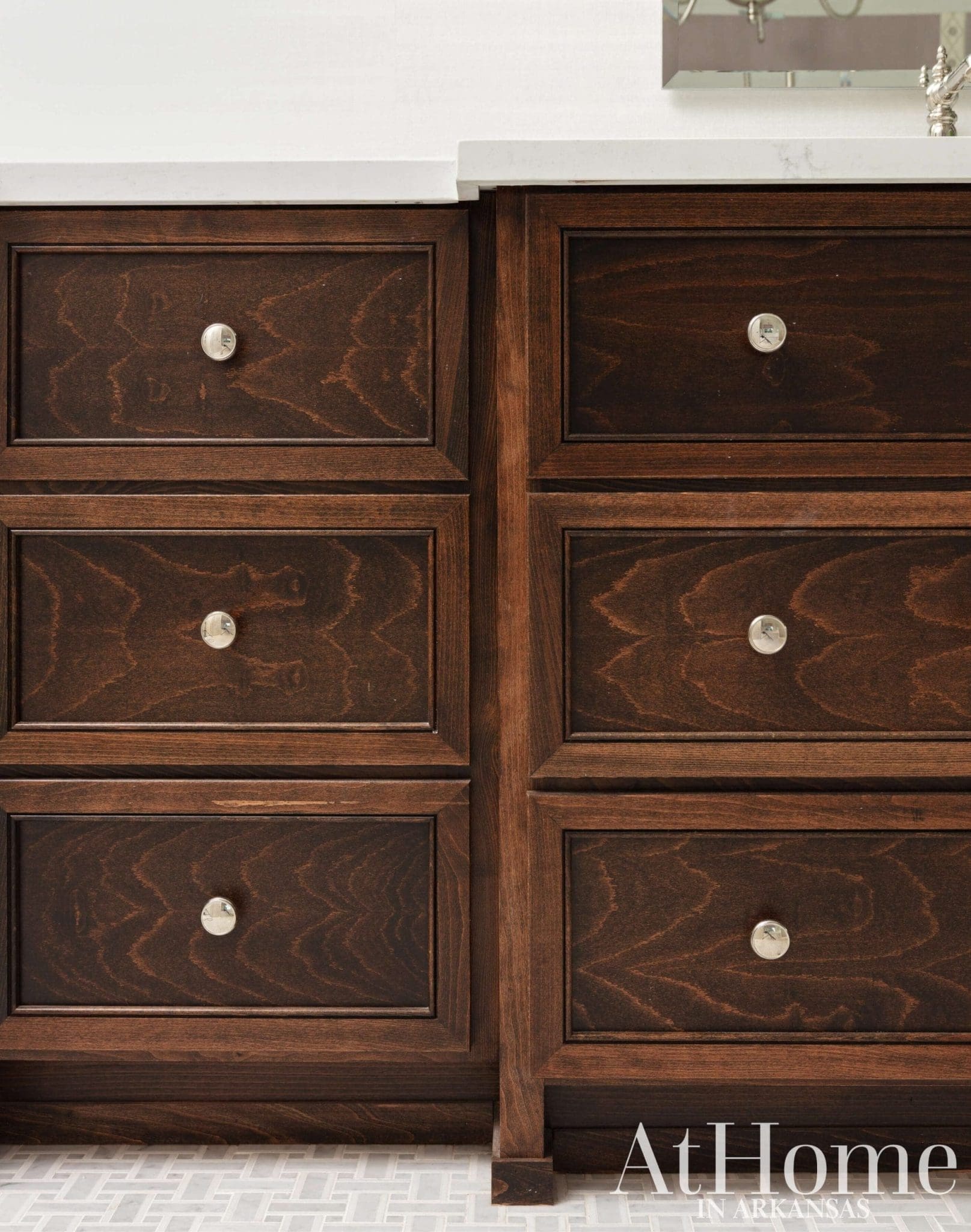
With the Grain
Inspired by some images seen on Pinterest, Kricia decided to use all drawers in the vanities instead of cabinet doors. The beechwood finish is stained an espresso color to allow the grain to shine through, and the wood tone adds warmth to the space.
Design Resources
Contractor Jimmy Carlisle, Carlisle Construction Interior design Kricia Palmer, MD, Allied ASID, House Calls for Physicians Countertops Affordable Granite and More Fixtures The Plumbing Warehouse Flooring The Tile Shop Paint Benjamin Moore Painting Interpretation, LLC Tile A&F Custom Interiors Wallpaper (installation) Lorita Herring Window coverings Cynthia East Fabrics
