Date: 2024-07-31 21:43:55 | Story: Kathryn O'Shea-Evans | Photography: Rett Peek | Styling: Angela Alexander |
Katie Rees works with a Little Rock couple to create a thoughtful and timeless family home

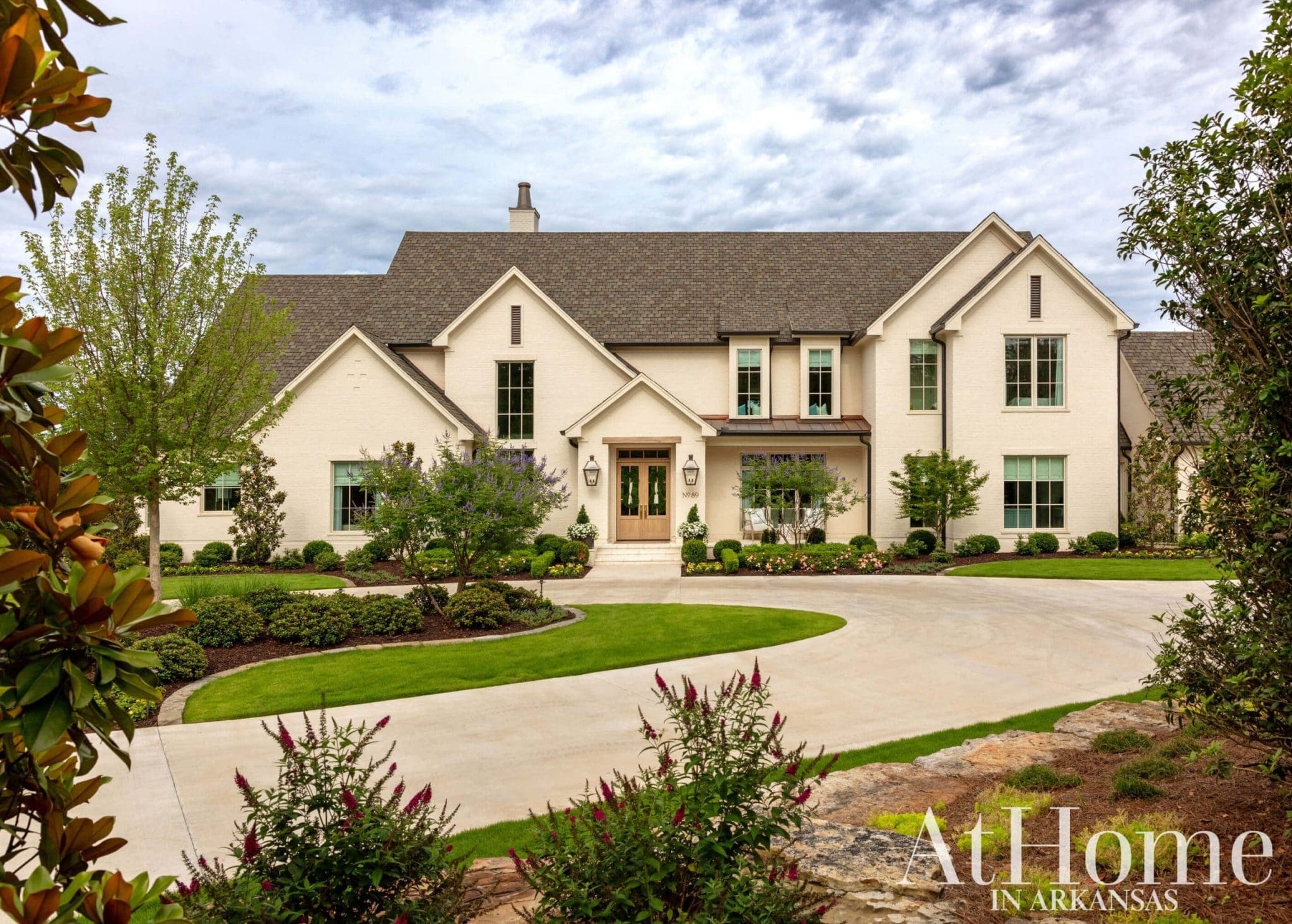
When building their new home, the overarching goal for Katie Rees and her clients was a certain levity that can feel especially serene in a family home. To accomplish this, Katie, along with architect Chad Young and builder Bill Parkinson, approached the plan thoughtfully while also keeping efficiency in mind. “I love their house because it’s really not overly massive,” Katie says. “They didn’t want this gigantic mansion, and they wanted it to still feel homey. Every space has a function,” the designer adds.
Indeed, the homeowner admits, every room in the home is purposeful. “Our goal was not just to build a house that we could live in as a family of five, but also a place where we can entertain and just have very intentional living spaces,” the owner says. “It needed to be open so that it would encourage this togetherness and also have space where we could gather with friends and family, as well as room that we could just grow into since we’ve got three young kids.”
In terms of style, Katie says the client wanted a “light and airy” look, noting that most of the interior is painted in Sherwin-Williams’ “Alabaster.” “She really did want her house to feel like it’s been here. It’s not trendy; it’s not going to have anything that dates it or says that it was built within the last year,” she adds. To achieve a timeless appeal, Katie leaned toward materials that have stood the test of time such as grasscloth wallpaper and tumbled marble. Of the latter, Katie says she “could just picture it in an older house,” noting it has a subtle and calm movement. “It just can’t go out of style,” she adds.
In looking at the home’s design during the planning stages, Katie also encouraged higher ceilings and more generous windows. “As a team, we all played a part in making sure it was perfect so that when it started going up, there were no disappointments,” the designer says. “That’s the beauty of having a lot of eyes on plans. The time was well worth it because I think, at this point, we wouldn’t change one single thing,” she adds.
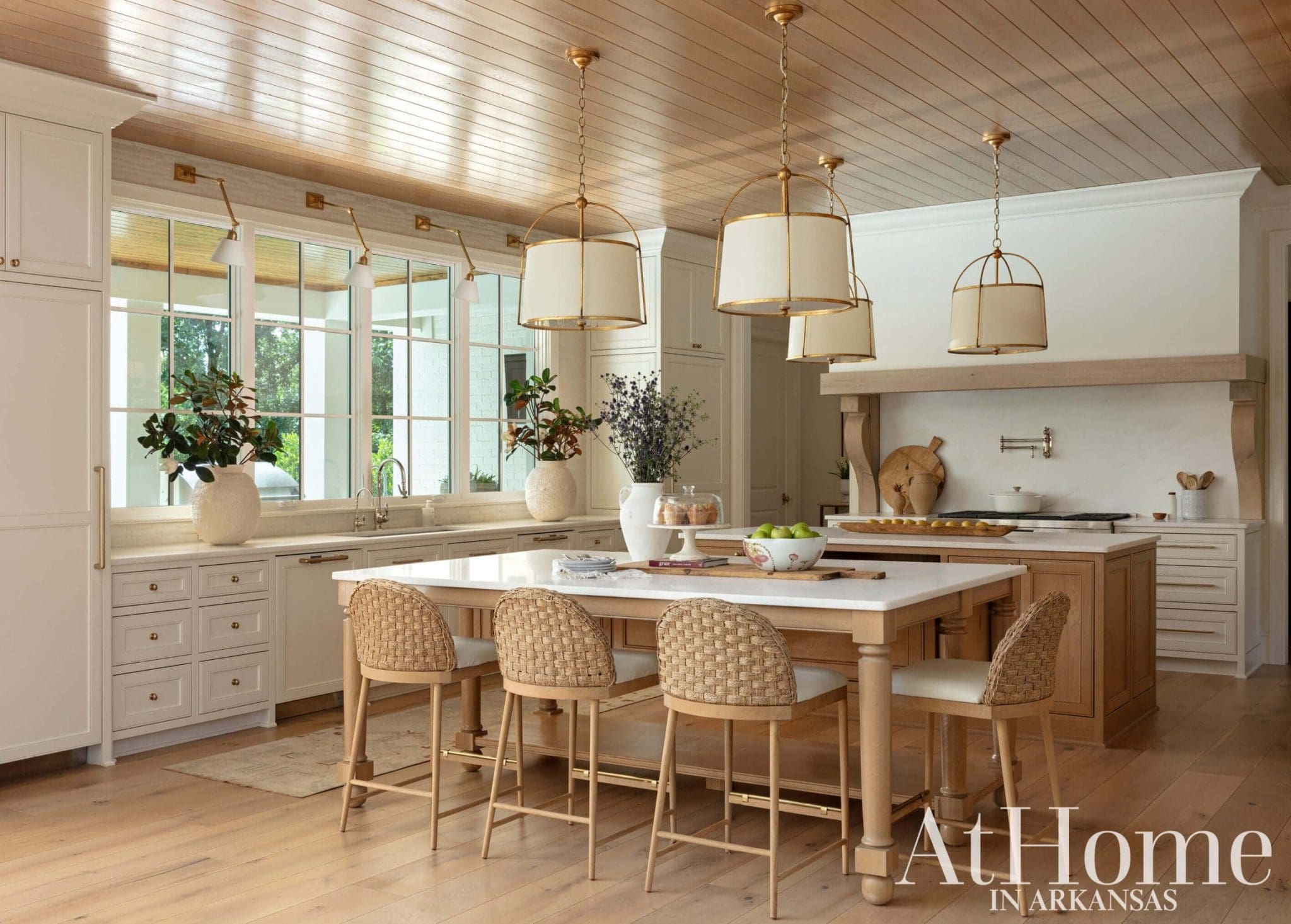 Now You’re Cooking
Katie answered this client’s request for two separate islands in the kitchen—one for eating and a second for meal prep. “She loves to cook, and they’re a super healthy family. I love [the two islands] because you can be making a mess while you’re cooking, but then your kids can still be sitting there without having all the prep stuff around,” the designer says.
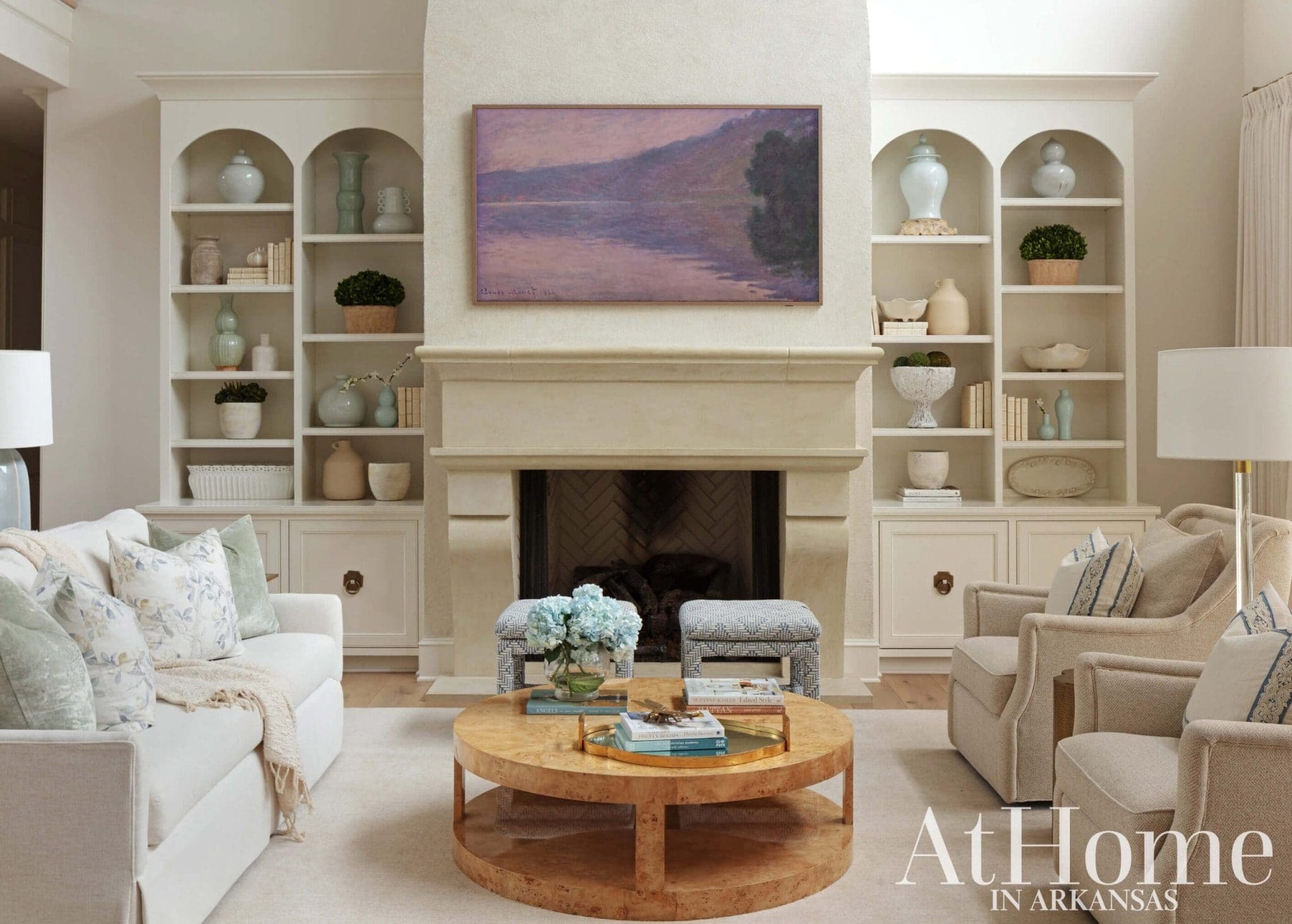 Living Large
Calm was really key for the homeowner. “I’m not afraid of color, but for my home I knew I wanted a retreat that was happy and welcoming with fabrics we could clean easily,” she says. Katie ups the spill-friendliness in the living spaces of family homes by opting for outdoor performance fabrics such as Crypton or Sunbrella. “I try to pay attention to all those little things so that it lasts and that in 10 years she’s still got all her pretty things,” Katie says. She also always recommends Samsung “The Frame” televisions to her clients. “They are great because you sometimes don’t even know that it’s a TV,” she says of the framed electronic that can display artwork when not in use. The walls are painted “Alabaster” by Sherwin-Williams.
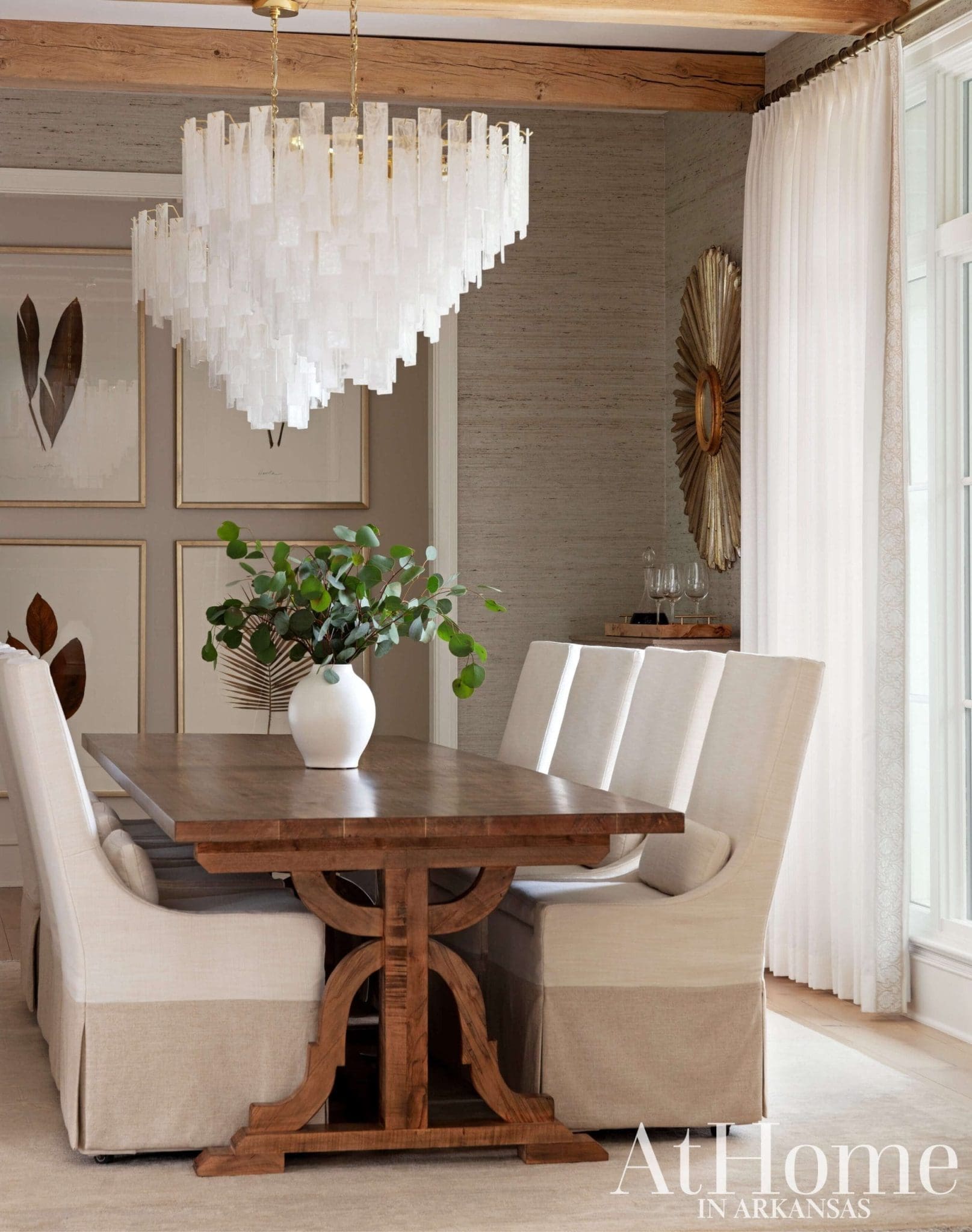 Dining Darling
“I love the drama of the chandeliers,” Katie says of this space that is often used when hosting guests. Overhead beams supply texture, while grasscloth wallpaper brings warmth and an earthiness that echoes the framed botanicals. “It’s a subtle color, but still very neutral,” Katie says. She notes the dining chairs are on castors, allowing them to easily roll back from the table.
“She wanted a little pop of color, but not too much where it was busy.”
—Katie Rees, designer
 Ladies’ Room
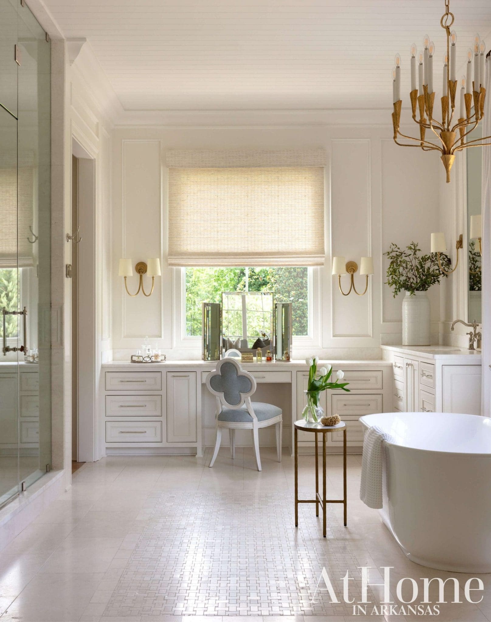
In the wife’s spa-like private bathroom, classicism reigns—down to a marble inlay tile ‘rug’ on the floor. “This bathroom is just a classic beauty,” Katie says. “It won’t ever date. The light that comes into that area makes it kind of shine just as it is.”
 Sleep in Style
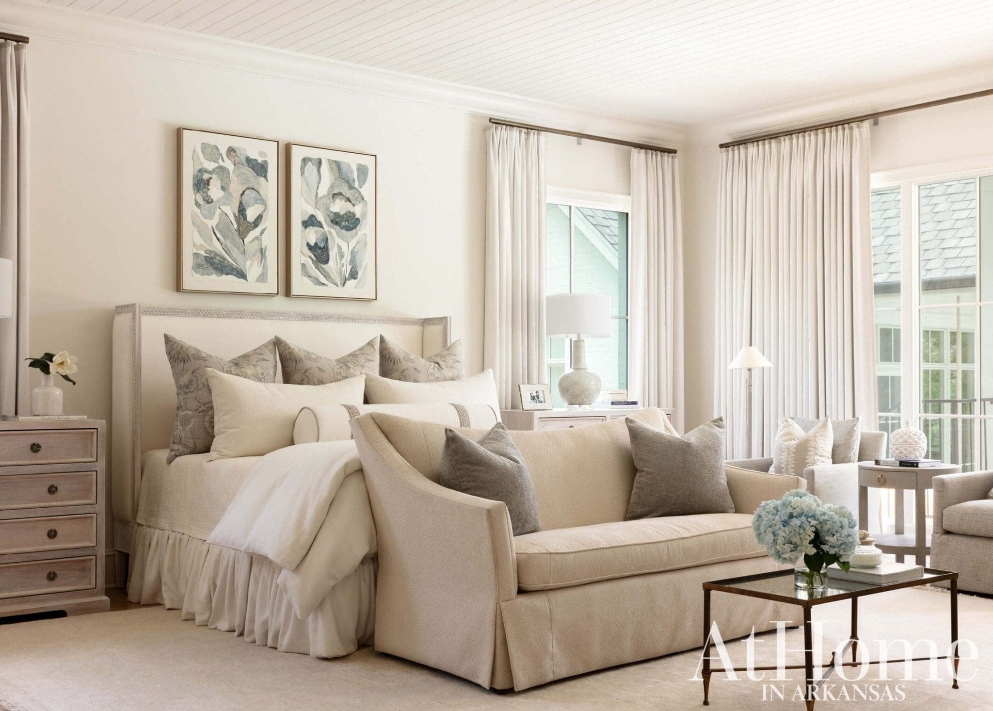
Laden with fabric and texture, the primary bedroom is one of Katie’s favorite bedrooms she’s designed in her career. “It’s just so dreamy,” the designer says. The strong neutral palette ensures that if the homeowner ever wants to change accent hues, she can easily.
 True Blue
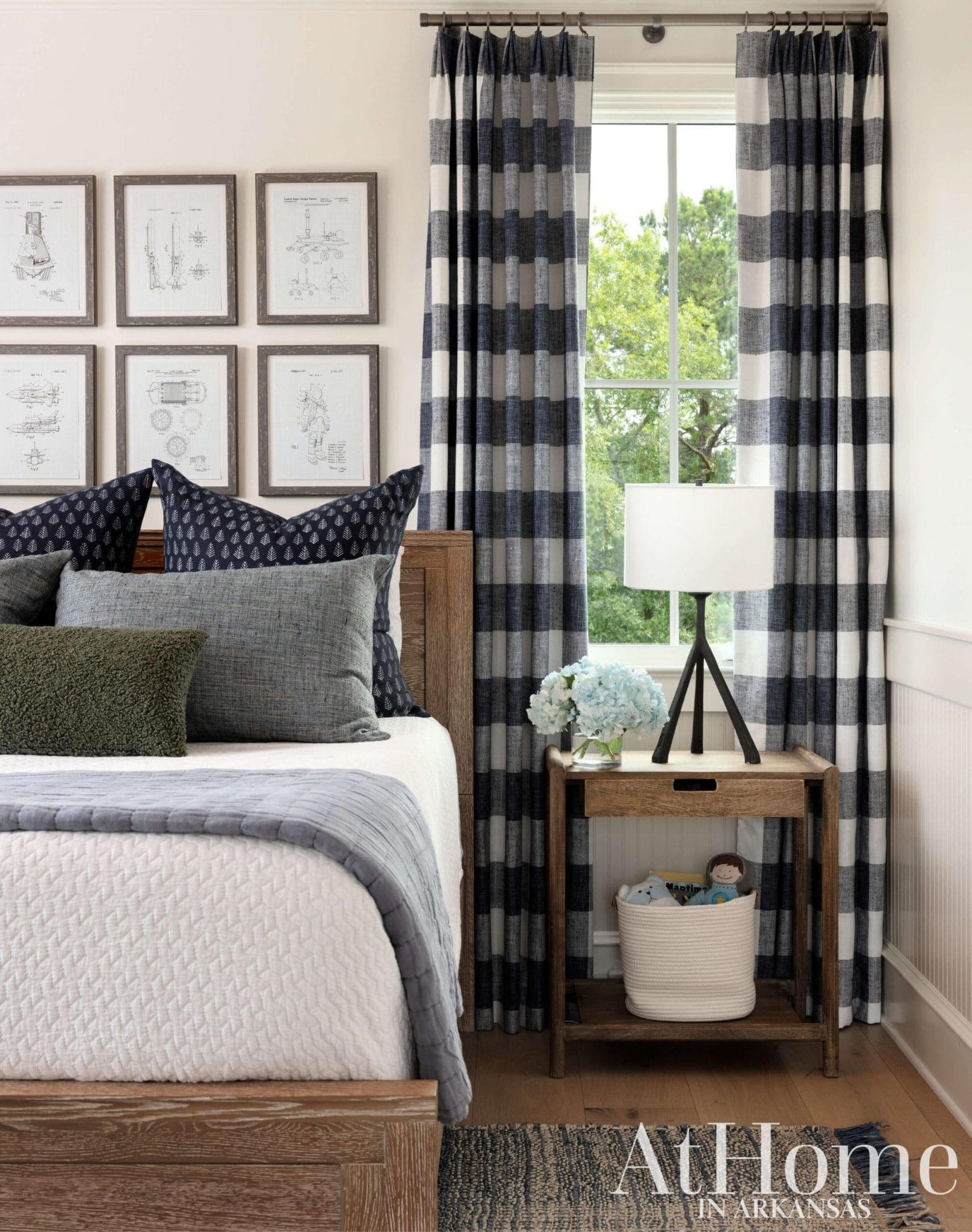
“We actually had a couple drafts of completely different houses, and I think that they were excited for all their kids to have an upstairs ‘kid suite’ with a homework area and all their bedrooms together,” Katie says. In this little boy’s room, navy blue gingham and chambray take the lead and are a fitting counterpart to the rocket diagrams used as art.
 Sleeping Beauty
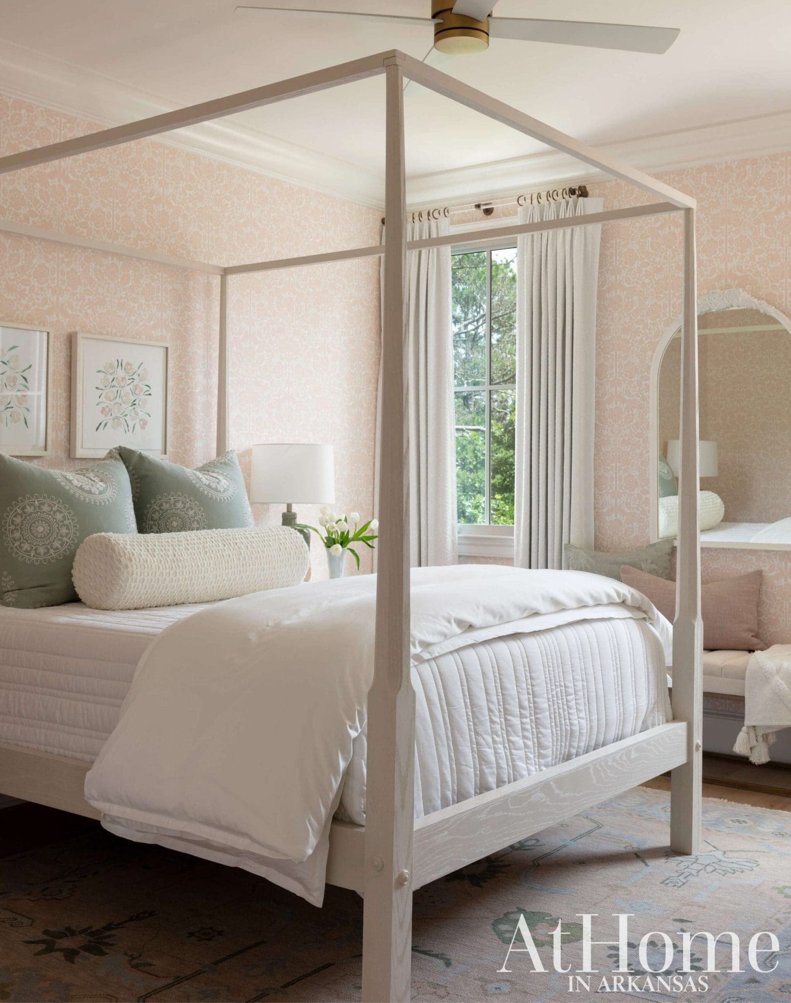
In this little girl’s space, a modern canopy bed and crisp white window treatments juxtapose with the soft peachy pink floral wallcovering for a prettiness that’s not saccharine. “There’s nothing over the top they couldn’t grow into or that they would have to redo any time soon,” Katie says.
 Child’s Play
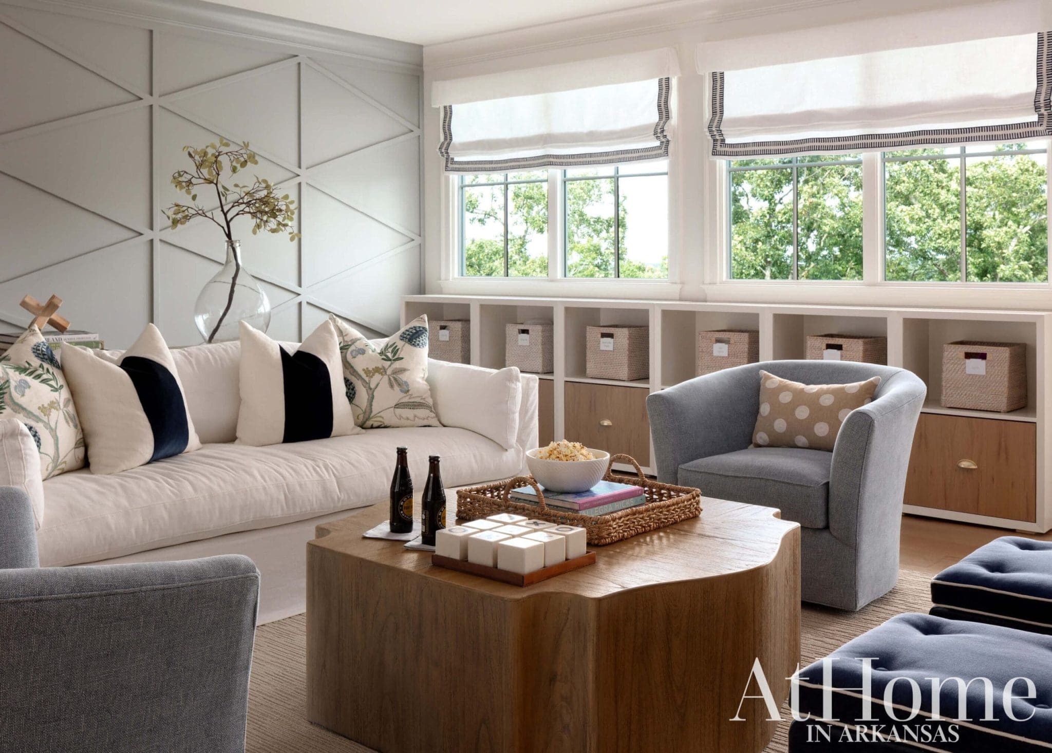
Katie created a private wing for the children that’s separate but still within easy reach of the parents’ space. It includes this playroom that has an accent wall featuring the same pattern as the barn doors that lead into it. Storage baskets keep toys and games neatly concealed.
 Tucked Away in Style
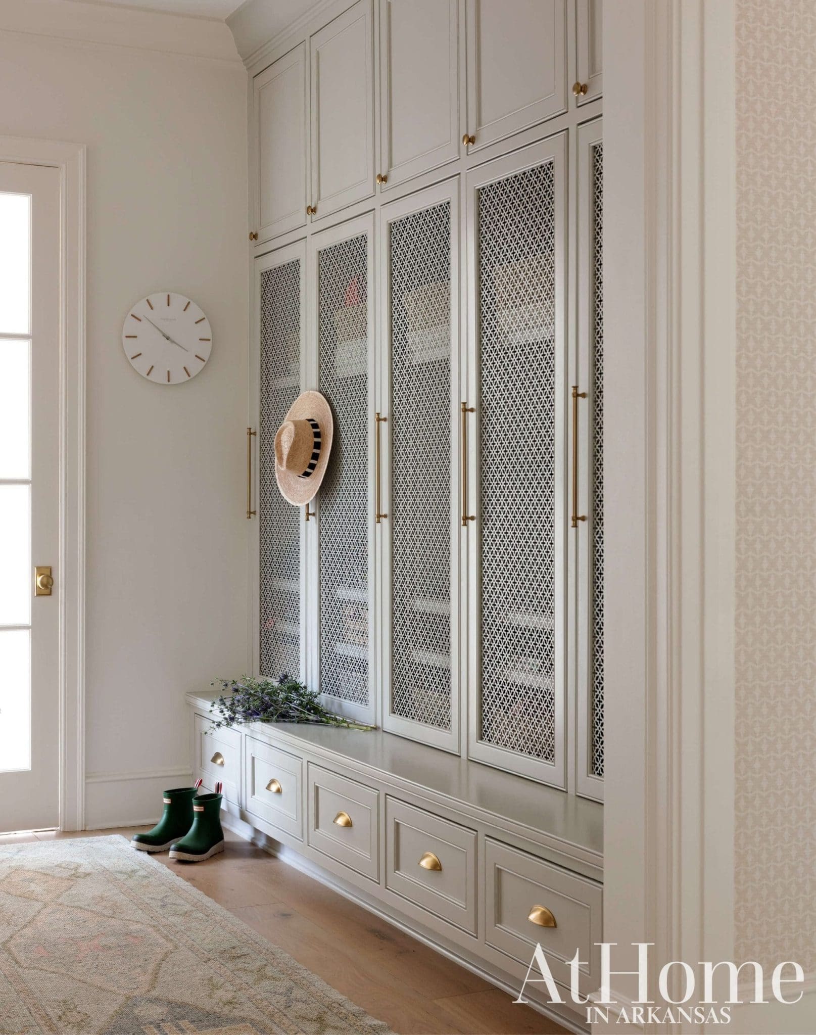
“The mudroom is all about function, but I love the metal detail that brings character to these cabinets,” Katie says. Each person in the family has a designated spot for all their necessities, and each cubby has a secret: “There are outlets for charging inside the lockers!” The cabinetry is painted “Colonnade Gray” by Sherwin-Williams.
 Resort At Home
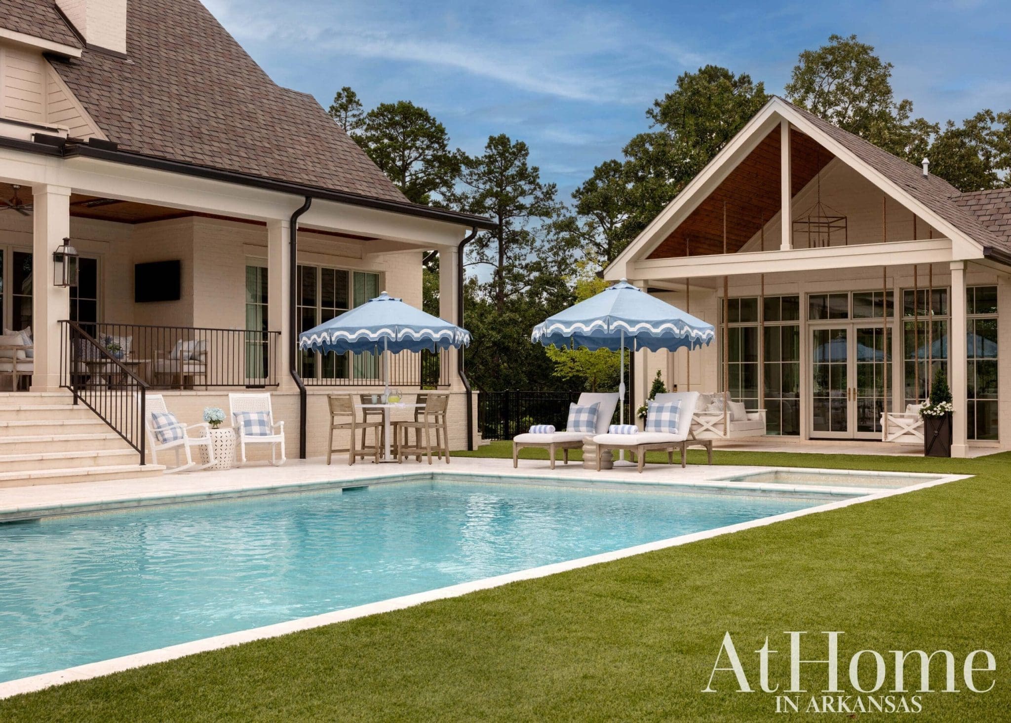
Katie’s clients built the ultimate pool and pool house—complete with a golf simulator, office, kitchen, and custom hanging daybeds from Nate & Lane. “We did turf around the entire pool, and used Peacock Pavers for the tile,” Katie says. “I thought the pop of blue was so fun to bring some of those same tones from the inside to the outdoors.”
Design Resources
Architect Chad Young, WDD Architects Builder Bill Parkinson, Parkinson Building Group Interior design Katie Rees, Katie Grace Designs Landscape design Zak Grothe, The Good Earth Garden Center Accessories Cobblestone & Vine, Katie Grace Designs, and Providence Design Appliances Metro Appliances & More Art Heike Talbert and Kristin Mccaslin ART Bedding, lighting, and rugs Katie Grace Designs Brick Antique Brick & Block Cabinetry, hardware, and millwork Duke Custom Cabinets Countertops Stone World Designs Fabrics Designer Effects Fireplace Olympia Construction Products Flooring Katie Grace Designs and ProSource of Little Rock Framing Cantrell Gallery Furniture Cobblestone & Vine, DP Designs, Katie Grace Designs, and Providence Design Ironwork Iron Paws by Anthony Billingsley Mirrors West Little Rock Glass Organization Rebecca Michelle Organizing Outdoor furnishings Ninth & Co. Paint Sherwin-Williams Painting PaintPlus Painting (decorative) AF Decorative Plumbing fixtures Westlake Plumbing Pool Better Lawns and Gardens Tile Katie Grace Designs, ProSource of Little Rock, and The Tile Shop Wallpaper (Installation) Mike Mace Windows Pella
