color confidential : pantone’s color of the year
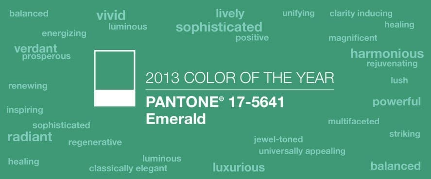
Q: Dear Tobi, I’m ready to do some major redecorating in my house. I know that Pantone promotes the colors they predict will be the trendy colors for the year, and I want my look to be current. How do I use those hot colors in a way that won’t be out of date before I can afford to redo my house again? Paula (Little Rock, AR) A: Great question, Paula! To trend or not to trend is a question I often get from my clients. My answer to them is always “Never EVER include something you don’t absolutely LOVE just to be trendy.” But the opposite is also true! “Never EVER leave out a fabric or piece of furniture (etc.) that you LOVE just because it’s trendy!” Trends come and go, but a particular style that you happen to find appealing is likely to keep its appeal no matter what’s fashionable. As for Pantone, their predictions are fun to talk about (it seems all of us design and fashion bloggers want to weigh in on the colors of the year!); but to make the most of the freshness of a color trend, use it as a cue instead of an exact style recipe. For instance, THE color of 2013 is Emerald (Pantone # 17-5641 to be precise!).
So, use this information as a point of inspiration for your a room in your home, if it’s a color you like! Instead of thinking only of the color Emerald, think of it as an indicator that rich greens and other jewel tones are going to be showing up more and more. I was excited to see that a green was selected, because it’s always been one of my go-tos! Want to see some ways I’ve incorporated greens in my own designs? As a pop of color in accessories!
As a major player in the color palette! 


As a foundation color! 
The key when incorporating a color trend is to do so confidently as long as you know it’s a color you truly love! Best of luck to you with your design, Paula! I hope this helps. Xo,
color confidential with tobi fairley
Ready to break beyond your comfort zone of neutrals but donât know how? How would you like to consult with color expert Tobi Fairley about it?
Interior designer Tobi Fairley has been recognized for her masterful use of color and pattern on the pages of House Beautiful, Traditional Home, Southern Living, and yours truly, At Home in Arkansas. And now Tobi will be fielding color questions from you, At Homeâs readers!
Thatâs right. Today, and monthly from now on, weâll be inviting readers to send us color questions for Tobi Fairley to answer in a tip and color filled blog series we’ve dubbed “Color Confidential with Tobi Fairley.” Picking paint. Finding fabric. Mixing and matching paint and fabric. Whatever your color quandary, send it our way!
Starting today, tell us: What is your color quandary? Let us know in the comment section of this post, and Tobi will select a question to answer on Tuesday, November 22! Colorful ideas await from Tobi Fairley. See you soon!
all about color
Welcome interior designer Tobi Fairley, whose expert tips on paint and color will be a mainstay on the At Home blog from now on! Each month, Tobi will be stopping by to help tackle our readers’ biggest color challenges. Given Tobi’s vast experience and reputation for bold patterns and paint, we can’t wait to see the solutions she provides and color combos she suggests.
Q:
Dear Tobi,
Everything in my house seems to be some boring shade of brown. Itâs not so bad with my Christmas décor around to spruce things up. But when I take them down in a few weeks my house will definitely go from fab to drab! What colors can I bring in to liven things up a bit for the new year? Help!!!
Brooke from Little Rock
A:
Brooke,
Thanks for writing to Color Confidential! I am so glad to be writing this new column for the At Home in Arkansas blog. There are quite a ways you can “jazz up” all that brown in your home. Here’s my advice:
I designed the room above with brown walls accented by coral. The chairs, rug and accessories are what make this room! When done like this, the brown isn’t boring! This home was featured in At Home in Arkansas in August 2010 and can be found here.
Here are the colors I used:
Walls: Sherwin-Williams SW6069 French Roast
Trim: Sherwin-Williams SW7012 Creamy
Adjoining Foyer: Sherwin-Williams SW6607 Red Tomato
Maybe red isn’t the way you want to go. Here are a few more options of pairing vivid colors with brown:
Yellow:
Sherwin-Williams SW6068 Brevity Brown
Sherwin-Williams SW6063 Nice White
Sherwin Williams SW6683 Bee
Turquoise:
Sherwin-Williams SW6081 Down Home
Sherwin-Williams SW6147 Panda White
Sherwin-Williams SW6472 Composed
Lavender:
Sherwin-Williams SW6083 Sable
Sherwin-Williams SW6553 Heavenly White
Sherwin-Williams SW6555 Enchant
Orange:
Sherwin-Williams SW6082 Cobble Brown
Sherwin-Williams SW7102 White Flour
Sherwin-Williams SW6641 Outgoing Orange
Now let’s take a look at pulling together a room adding accents of color. Imagining that we are starting with the brown room with yellow accents pictured in the example above, I’ve come up with the following:
Clockwise from top left: Sherwin-Williams paints as mentioned previously, Atlas Pillows in Chocolate from Tobi Fairley Home, Capri Gourd Lamp in Yellow from Jonathan Adler, Chauncey in Buttercup Fabric by Highland Court, Sunflower Ticking Woven Cotton Rug by Dash & Albert and available through Cobblestone & Vine.
I hope this gets you well on your way, Brooke, to adding some inspiring color accents to your home. As you can see, brown isn’t that bad after all!
Happy Decorating!
Tobi
color confidential with tobi fairley: decorating with pink
Tobi Fairley is back with the first 2012 installment of Color Confidential! Today, she takes a cue from a Bentonville reader, and fills you in on decorating with the girliest of colors: pink! Read on to see how to incorporate it into your home, without going over the top.
Q:
Dear Tobi,
With Valentineâs Day just around the corner, it seems that everywhere I look I see pink â and I love it! Do you have any suggestions for using pink in my home without going too over the top? Thanks!
Kathy, Bentonville
A:
Hi Kathy,
Thanks for writing in to Color Confidential! I, too, love pink and try to incorporate it in my projects whenever possible. A girlâs room, whether sheâs a newborn or a teen, is one of my favorite places to bring in this color. By using it sparingly in patterns and on solid accessories, you can create a fun feel thatâs anything but over the top.
Hereâs a project that was recently featured in At Home in Arkansas, where we grounded the different shades of pink with a range of neutrals including white, cream, and chocolate. Solid traditional wood floors, as well as neutrals for both the furniture and bedding, gave us plenty of room to add touches of pink in other places, including the wallpaper, drapery panels, rug and lamps.
If you want to use a bold color on a larger piece, such as this built-in seating area, consider a neutral framework or wall color. The wood base and cream-colored storage bins used here help to keep the bright pink cushions from becoming overpowering.
Girlsâ rooms arenât the only place you can use pops of pink.
The white walls and sofa are the perfect backdrop to bring in this bold shade.
If you already have a lot of patterns and textures in a space, consider adding one single piece, like this low sofa, to create a bright focal point.
If softer pinks are more your style, gray can be a great pairing. The drapery panels here really lighten this space and give it an elegant feel.
Finally, if youâve experimented and youâre ready to go all in, paint your walls in your favorite shade of pink and accessorize with black and white and maybe a pop of something sassy like chartreuse!
Here are a few of my favorite pinks and some great neutral pairings for any space.
Mix it up with a navy and creamy white.
Sherwin-Williams, Amaryllis SW6591
Sherwin-Williams, Regatta SW6517
Sherwin-Williams, Summer White SW7557
Go for a lighter, more airy feel with a softer shade of pink and gray.
Sherwin-Williams, Priscilla SW6575
Sherwin-Williams, Ibis White SW7000
Go all out and mix two shades of pink with a light neutral.
Sherwin-Williams, Bella Pink SW6596
Sherwin-Williams, Haute Pink SW6570
Sherwin-Williams, Crème SW7556
Follow my âIn the Pinkâ board on Pinterest to see more of my favorite ways to incorporate pink in to your home.
I hope you find the perfect pink for you!
Happy Decorating!
Tobi
color confidential with tobi fairley: decorating with neutrals
Q:
Dear Tobi,
I love using neutrals in my home, but I still want it to feel fresh and up to date. Are there any popular neutrals that you can recommend?
Leslie, Pine Bluff
A:
Hi Leslie,
Thanks for writing in to us! This is a great question and one that Iâm sure lots of other people wonder about as well. Neutrals are a classic look that can always be in style, but I am continuing to see gray as a very popular color. Here are three of my favorite shades for living and sleeping spaces.
Pearl Gray (Sherwin Williams 0052) is a light, fresh shade of the color.
Silvermist (Sherwin Williams 7621) offers a shade that has lots of blue undertones.
Uncertain Gray (Sherwin Williams 6234) provides more saturated color.
Recently, there has also been a huge trend toward âgreige,â or a mix of gray and beige tones. Greige is popping up everywhere, but itâs especially hot on kitchen cabinetry.
Here are a few of my top Greige picks.
Morris Room Grey, SW0037
Universal Khaki, SW6150
Amazing Gray 7044
Last, but not least, if you want something deeper choose a charcoal gray. You can use it as a wall color to create a cozy look or in accents. It also pairs well with brights if you like to accent with a few pops of color here and there. One of my favorite combinations is charcoal and yellow. You can pair a deep wall color with accents like the ones I use in my Home collection.
[From top left: Grizzle Gray SW7068 paint chip, Venus, Atlas and Athens pillows from Tobi Fairley Home, Rothesay Lantern from Tobi Fairley Home and Bistro, Athens and Marrakech fabrics.]
I hope this ânewâ neutral is just what youâre looking for in your home!
Happy Decorating!
Tobi
g is for giveaway! win two tickets to tobi fairley’s design camp a to z
We’re partnering with Tobi Fairley to give away two tickets to her popular Design Camp A to Z, May 16-18! To enter, simply leave a comment on this post. The contest closes April 30 at midnight.
During this three-day, all-inclusive experience at her studio, Tobi walks campers of every skill level through all 26 letters of the alphabet. The best part is, campers leave the course with all the tools necessary to help bring a room to life!
Here are a few of the topics:
- A is for Art
- B is for Budget
- F is for Fabrics and Finishes
- I is for Inspiration
- N is for No Nos-Avoiding designers’ biggest mistakes
- S is for Style and Shopping
- X is for X-tra special ways to take your project to the next level
On top of all that, the camp is a complete blast. Get to know other enthusiastic design attendees during the daytime classes and also at two fun evening events featuring plenty of drinks and hors d’oeuvres.
If this giveaway doesn’t pique your interest, we don’t know what will! Don’t forget to leave a comment… and check Tobi’s web site (here) for more information about her popular design camp series.
**Giveaway includes tuition and food/transportation during the camp as provided through Tobi Fairley Interior Design; travel to/from design camp and hotel/accommodations are not included.
color confidential with tobi fairley: selecting a trim color

color confidential with tobi fairley: bringing home the beach

Q: Dear Tobi,
I want to use some cool colors in my house that remind me of our beach vacations. I love the way you add so much color to a space. Do you have any paint recommendations that will help me achieve a similar look?
Sincerely,
Diana, Little Rock
A: Hi Diana. First of all, thank you for the compliment and your question! It’s certainly the right time of year to be thinking about this.
Summer is right around the corner, which means many people are anticipating beach vacations. Cool colors found in the ocean are so inspiring. Whether it’s the navy water of the Northeast, the jewel-toned colors of the Emerald Coast, or the turquoise shades found in the Caribbean – inspiration is abundant!
One of my tips for adding vibrant colors to a space, is to select a light or muted color for the wall. You can then layer in more saturated colors with painted furniture, art, or accessories. Here are some interiors that I designed using cool colors, along with a few paint colors from Sherwin Williams to help you with your space.


I hope one of these palettes will work for your home and that it will remind you of your favorite beach spot!
Be sure to check out my Pinterest boards boards for more “blue” ideas and watch my blog for some of my favorite beach finds later this week.
Happy Decorating!
-Tobi
Note: All paint colors are Sherwin-Williams.
color confidential with tobi fairley: warm hues

Q: Dear Tobi,
I loved your post here last month about bringing cool colors in to your home. However, I’m more fond of deep, rich colors. I guess I tend to lean more toward warm hues in general. Do you have any go-to colors that remind you of warmer landscapes?
Thanks!
Lauren, Jonesboro
A: Hi Lauren,
That’s a great question! Because warmer colors tend to make a bright statement and can have a bold impact, I generally use them as accents throughout a space.

(photography by Nancy Nolan)
For example, you might cover your chairs in a fiery shade of red, like the ones I used in this dining room. You could also paint an accent wall in a vibrant tangerine. Lamps and throw pillows are also a great way to bring in these colors without making a huge time or financial commitment. If you’re DIY-savvy, you could even paint a few pieces of furniture in one of these happy colors! The options are endless…
When it comes to selecting warm colors I love to look to nature. There are a ton of naturally occurring options in everything from sunsets to fall foliage. But to get back to your original question on which colors to use, I’ve selected a few that remind me of the warmer landscapes you mentioned. [All paint colors are Sherwin-Williams.]


If you want something that is a bit deeper and more rich you might try one of these…


Hopefully one of these colors will be just what you’re looking to use in your own home!
Happy Decorating!
-Tobi
(p.s. to see more color confidential tips, visit here.)
[Images: Google Images, Tobi Fairley Interior Design]