 Q: Dear Tobi, I’m ready to do some major redecorating in my house. I know that Pantone promotes the colors they predict will be the trendy colors for the year, and I want my look to be current. How do I use those hot colors in a way that won’t be out of date before I can afford to redo my house again? Paula (Little Rock, AR) A: Great question, Paula! To trend or not to trend is a question I often get from my clients. My answer to them is always “Never EVER include something you don’t absolutely LOVE just to be trendy.” But the opposite is also true! “Never EVER leave out a fabric or piece of furniture (etc.) that you LOVE just because it’s trendy!” Trends come and go, but a particular style that you happen to find appealing is likely to keep its appeal no matter what’s fashionable. As for Pantone, their predictions are fun to talk about (it seems all of us design and fashion bloggers want to weigh in on the colors of the year!); but to make the most of the freshness of a color trend, use it as a cue instead of an exact style recipe. For instance, THE color of 2013 is Emerald (Pantone # 17-5641 to be precise!).
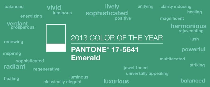
So, use this information as a point of inspiration for your a room in your home, if it’s a color you like! Instead of thinking only of the color Emerald, think of it as an indicator that rich greens and other jewel tones are going to be showing up more and more. I was excited to see that a green was selected, because it’s always been one of my go-tos! Want to see some ways I’ve incorporated greens in my own designs? As a pop of color in accessories!  As a major player in the color palette!


 As a foundation color!
 The key when incorporating a color trend is to do so confidently as long as you know it’s a color you truly love! Best of luck to you with your design, Paula! I hope this helps. Xo,


