 Photography by Nancy Nolan; Design by Heather Chadduck
{paint colors: shagreen; parma gray; filtered shade; paradise}


photography by nancy nolan | styling by mandy keener
{paint colors : wild elderberry; monsoon; notable hue; cook’s blue}
Ever wonder which items your favorite designers, tastemakers and folks about town just can’t live without? We definitely do! To sate our curiosity, we’re asking a different person to share a few of their favorite things each week. This week, art director Mandy Keener tells us what she can’t live without.1. Iconic Eames
I would totally have a house full of chairs, but that’s probably not ideal… I started my collection with this Eames.
Every time I see this I just chuckle. It adds a bit of humor to my walls, plus who doesn’t love Bill Murray?
I have an obsession with estate sales and animals. The Golden Hippo caught my eye at one of Roy Dudley’s sales, and of course he had to come home with me. Little art is also one of my favorite things as well. I scooped these little pieces in Boston on Newbury Street. Street art is hot. Just wait! These could be worth millions some day…
Well, anything from Jonathan Adler, really. He’s my favorite. We could all use a little place for our Glitter or Dolls…you know.
5. Paint
It goes a long way! Keeping white and gray on most of the walls in my house, I added these two accent colors. It made a big statement and I love it! Jamacia Bay for the front door and Knock Orange on one wall in the kitchen, which you can see thru the front window. It’s the easiest way to change up a room, and I am known to change my mind about color frequently!
Find color inspiration on the pages of At Home in Arkansas! We are pulling paint colors from some of our favorite images and sharing these custom color palettes with you in our Color Coordinated series!
 {photography by nancy nolan | design by bear-hill interiors}
saratoga springs  |  delightful  |  parma gray  |  gray palomino

Find color inspiration on the pages of At Home in Arkansas with these custom paint palettes inspired by some of our favorite images from the current issue. Read about this foyer on athomearkansas.com or in the January/February 2013 issue.

{ photography by nancy nolan | design by kaki hockersmith }
We are excited to unveil Sherwin-Williams‘ color forecast for 2014. The forecast is represented by four colorful paint palettes and is influenced by fashion, nature, pop culture and global traditions. These new colors will undoubtedly inspire many painting and home design projects in 2014. Jackie Jordan, director of color marketing, along with Sherwin-Williams color experts, researched and selected 38 key colors for the forecast, which are grouped into four palettes: Reasoned, Diaphanous, Curiosity and Intrinsic.
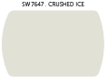
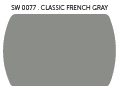
Reasoned “The hues of Reasoned, which include black, gray and whites, represent shadows, negative space and tone-on-tone layering,” said Jordan. “Gray is the new black. We see this as a perfect palette for a home office, study or modern kitchens by layering colors such as Crushed Ice (SW 7647) and Classic French Gray (SW 0077).”

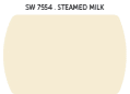
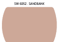
Diaphanous The delicate nature of this palette embodies the very essence of balance, simplicity and elegance. The colors of Diaphanous are light, delicate and translucent. Society’s need for overconsumption has given way to minimalism and a quiet reality. This palette evokes tranquility, sensuality, serenity and escape. “We are experiencing this blurred duality all around us, from menswear influences on feminine clothes to the soft-touch material on electronics,” said Jordan. “Incorporate Diaphanous colors such as Steamed Milk (SW 7554) and Sandbank (SW 6052) in a bedroom, nursery, living room or bathroom.”
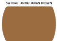
Curiosity It has been said that what one may see as strange and unique, another may see as beautiful. This is the wonder of the Curiosity palette, which is largely driven by science and geology. Nature at the most molecular level is becoming a resource for patterns, textures and colors. Mined minerals, metals and raw gems also fuel the color story. “The Curiosity palette is mad science meeting fantasy; it’s avant-garde, experiential, dark and exotic, ” said Jordan. “Alluring colors such as Exclusive Plum (SW 6263) and Antiquarian Brown (SW 0045) make perfect choices for a den or romantic bedroom.”

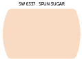
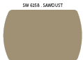
Intrinsic A little bohemian and plenty of color make up the Intrinsic palette. Its focus is around embracing and preserving tradition, culture and design, while bringing in new influences. “World events like the upcoming Winter Olympics in Russia are driving new appreciation of folkloric costumes, patterns and design,” said Jordan. “Choose hues from the Intrinsic palette like Capri (SW 6788) and Sawdust (SW 6158) for a celebratory family room, kitchen or kid’s room.”


To see the full Sherwin-Williams 38 color line up for 2014, click here. Now, what are you inspired to paint?

At Home in Arkansas offers you a look inside the state's most inspiring homes. The magazine features monthly advice from the experts to help you plan your next remodel or redesign, entertain at home, or find Arkansas's best kept secrets. It is your definitive guide to the state's finest homes and gardens, design professionals, fashion and entertaining essentials, and premier shops and showrooms.
